 Will Your Website Lose Half Its Audience?
If you have been receiving mysterious notices from Google warning you that your website is not mobile friendly, you are not alone. The notice subject line may read “Fix mobile usability issues found on http://yourwebsite.com.” These notices have been going out for months to owners of websites that have Google Webmaster Tools integrated into their site. Google is warning users, not just that their websites are not built for today’s mobile devices, but that those websites will soon be penalized in Google searches from mobile devices.
When we were first able to view websites on our telephones, it was amazing. We were so excited by our newfound technology and its possibility, that we were able to overlook the challenges.
The Challenge of Mobile Website Viewing
It was not long before we became annoyed and frustrated as we tried to navigate websites designed for large computer screens on the relatively tiny screens available on our phones. There was a lot of scrolling, pinching, and expanding on the screen in the attempt to navigate the large spaces, tiny text, and expanding menus. The advent of tablets, also considered mobile devices, helped, but they were still a bit small and did not fix our small-screen issues on phones.
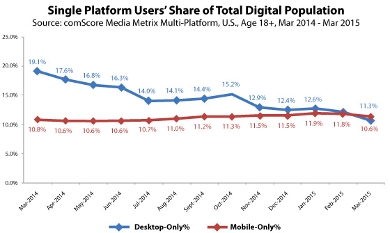
Mobile Traffic Is Significant and Growing
Despite the challenges of viewing websites on mobile devices, people have continued to use them more and more. Today, estimates range, but commonly report that 30-50% of users are accessing websites from mobile devices.
Google has recognized the importance of mobile devices and the usability challenges they present. The dominant search engine provider has announced that beginning April 21, 2015, if your website is not “Mobile Friendly,” it may be getting penalized in search rankings from mobile devices. Further, Google has made vague predictions that a day may come soon when they host an entirely different search index and algorithm for searches conducted from mobile devices.
SEO
Search Engine Optimization (SEO) is one of the hottest invented industries this century. Everyone wants to show up first in search results. Google is the clear search industry leader, with approximately 65.4% of all US search requests. Yahoo is third and has recently grown to 11.8% of search market share after brokering a deal with Mozilla. Google’s industry dominance continues in mobile search, where they hold an astonishing 84% of market share.
Google Dominance
Professionals who optimize sites for SEO must focus on Google due to Google’s dominance in search market share. That means that the vast majority of optimized sites have been optimized for Google search, since the professionals who optimize sites tend to do so for Google. Trailing search engine companies must also include, as best they can, Google rules in their algorithms if they hope to properly rank sites optimized for Google in their search engines. In search, the world revolves around Google, so Google guides the industry.
Google Leads the Way for Better User Experience
Google has a very specific goal in search. Google is trying to provide the most accurate search results possible for any given user. To that end, Google screens out sites that try to game the system and get undeserved higher rankings. The details of their search engine algorithm are a tightly kept trade secret to prevent SEO optimizers from gaining undeserved advantage for sites they manage. They also provide public rules for optimizing sites, encouraging website owners and their managers to follow prescribed best practices so that Google can properly rank their sites.
The Move to Isolate Mobile
Since the “search and explore” Internet experience is fundamentally different for computer users and mobile device users, both in screen format and often in context (searching on the go versus searching at your desk or on a laptop in a settled position), Google is reflecting that in the search results. Their goal is simply to provide the best search results for the user. And, if the user is searching from a mobile device, that is going to be a considered factor.
 Optimizing Your Website for Mobile
There are two mainstream ways to make your site “friendly” for mobile devices: the independent mobile version and the more recently popular sites featuring “responsive” designs.
The Independent Mobile Version
For years now, there has been a practice in place of building alternative websites optimized for mobile viewing. The browser actually checks to see if the user is coming to the site from a mobile device, and if so, it displays (serves) the independently created mobile version of the site. This requires a completely separate build of the website, designed specifically for mobile devices. Often these sites feature less, and more focused, content. The idea is to provide the content that is most important for mobile users in a format that is more user friendly. A big item on that short list of featured content is a “push to dial” phone number: a real convenience for those who access the site from a phone.
The Responsive Website
Responsive designs for websites use the same website and content for both mobile and desktop devices. The difference between these sites and traditional site designs is that responsive designs feature a rule set that alters the way the site is displayed based on the screen size of the user. Rather than shrinking the site so that it fits on a smaller screen, content is often stacked on smaller devices that do not have the horizontal space available to desktop screens. The smaller the device, from tablet size to phone size, the more stacking that occurs, typically without significant shrinkage of graphics. Menus and other functions are often condensed and even feature alternative layouts to better fit the smaller formats.
Choosing Your Mobile Format for SEO
Having a separate, independent mobile site will satisfy the immediate Google requirement to be mobile friendly. For now, the regular (desktop version) site will still be indexed by Google as usual, and any work put into optimizing a site for search engines will still benefit the site in search results — whether from a mobile device or a desktop computer.
However, if and when Google follows through and creates a separate search index for mobile devices, it may look only at the version that is designed for mobile devices. So an independent mobile version of the site will have to have to duplicate the complete content of the desktop site to index properly. A responsive design has the benefit of actually using the same physical site files and will still benefit from all of the content they provide, whether from a desktop search or a mobile search. One site. One set of content to manage.
Take Action
Google has not officially announced the launch of a separate search index for mobile. It did announce the need for all websites to have mobile friendly sites by April 21, 2015, when “mobile friendly” will be used as a ranking factor for those searching from mobile devices. The time to make sure you are prepared for mobile devices is now, or you may begin missing out when it comes to all of the users (typically 30-50% and growing) searching for and using your site from mobile devices.
Contact your qualified website provider to discuss your options for mobile. If you don’t have a mobile friendly site, your rankings may already be depressed, and you’ll want to rectify the situation as soon as possible. Check with your provider as soon as you can, particularly if they manage multiple sites. Undoubtedly providers are already busy updating sites for customers who have realized that their sites are not indexing as well for mobile search traffic since April 21st.
Bryan Carter is the President and Owner of Think Webstore in Ridgeland, Mississippi, and author of business publications. Contact him at www.thinkwebstore.com or bryancarter@thinkwebstore.com.